CSS Responsive Website tips & tricks
How to code a responsive website || CSS tips to remember for


There are many different techniques and approaches to making a website responsive with CSS, but here are some tips to help you get started:
1: Use relative units:
Instead of using fixed units like pixels, use relative units like em or rem. This will allow the layout to adjust based on the size of the user's screen.
2: Use a mobile-first approach:
Start by designing the website for the smallest screen size first and then add styles for larger screens. This ensures that the website looks good on all devices.
3: Use CSS grid:
CSS grid is a powerful layout tool that can help you create responsive designs. It allows you to create grid-based layouts that adjust based on the size of the user's screen.
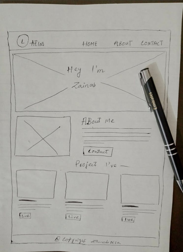
💡 pro tip
if u’re going to clone any website or starting a new website, try first to create its row-column wireframe on paper, this will ever help you to code with clean & fast speed.
4: Minimize the use of absolute positioning:
Absolute positioning can break the layout on smaller screens. Instead, use relative positioning or flexbox to position elements.
5: Use viewport units:
Viewport units allow you to specify sizes based on the size of the user's screen. For example, you can use vw (viewport width) to specify a width that is a percentage of the user's screen width.
6: Use media queries:
Media queries allow you to specify different CSS rules for different devices. For example, you can use a media query to change the font size or layout of a page when it is viewed on a smaller screen.
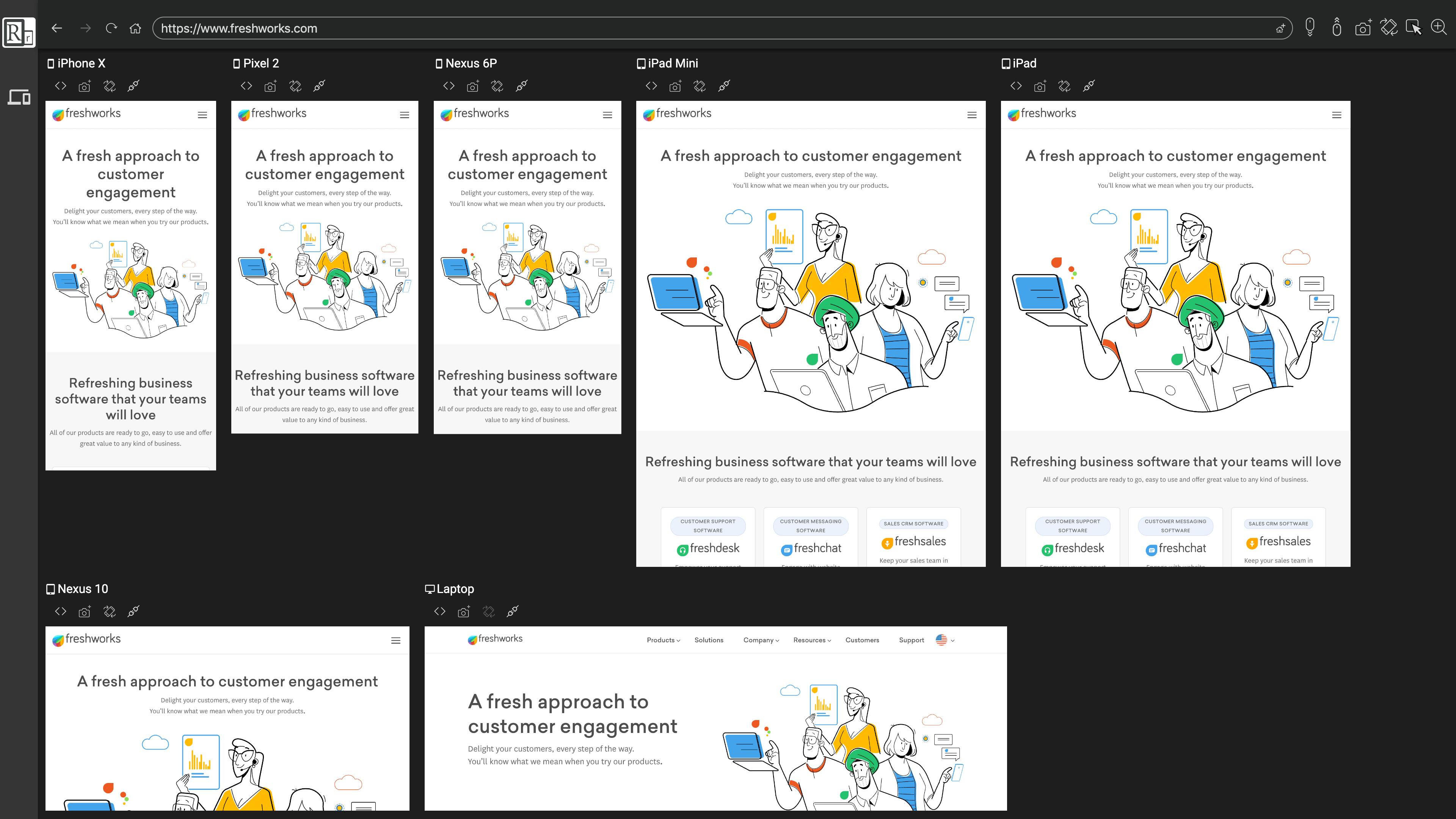
💡 pro tip
you can use responsive viewer extension in your browser to keep track for ur responsive designs. https://responsiveviewer.org
So, that's it for today!!
Thank you so much for tuning in! If you want more content like this, don't forget to hit that like button.